
I Like Pretty Things
When I talk about pretty things, I am not referring to people or places. While I do appreciate those to be pretty as well, that is not the focus of my efforts here. To put what I mean about liking pretty things into perspective, I must give a bit of my background.
Then
Looking back through my life, I cannot pinpoint a single change that moved me from slob to what I am today. I can say that the cumulation of effects from many influences in my life has shaped my attraction to pretty things.
My time in the Army did something for me that was not necessarily transmitted to every other 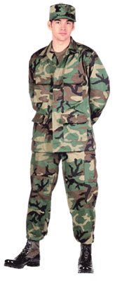
soldier. First, in basic training, we are expected to keep our crap in order. That means that our lockers are all uniform and neat; our barracks are clean and polished; and we are well groomed and our attire is appropriately adjusted. If you were wearing BDUs (battle dress uniform – the normal woodland camouflage clothing no longer worn by the Army), you were to ensure that your boots were well polished, the uniform was pressed (no starch, yet), all of your buttons were buttoned, and any rank or insignia was correctly placed on the uniform.
As a cook, I was subject to “cook’s mount” before every shift. We were required to keep our fingernails neatly trimmed, our hair within regulations (to include facial hair), our shoes shined, and our mess whites neatly pressed (and white).
As I said, this didn’t carry through to everyone as I have seen many veterans that are total slobs, even fresh out of basic. I have seen homes and rooms that were reminiscent of a teenager’s bedroom.
If the Army wasn’t enough to make me a neat-freak, when I settled on my major as an undergrad, it was in cartography (map making). Dr. Elijah Johnson was the head of the cartography section. He taught many of the classes I had to take. One of his pet peeves was that text must not be upside down. That was grounds for failing any given map. We are not talking about the obviously flipped text, we are talking about a vertical label that might break over by a degree or less. If it broke the wrong way and we didn’t correct the direction of the text, it was an F on that assignment.
Moving into the survey realm, I found that “perfection” was a near requirement. “Close enough” would not get you by. Like math (and much of it was math), in the end, there can be only one answer (sure, there can be an array, but…). In surveying, you literally generate errors with the best of attention. If you do allow yourself to become distracted, you can create catastrophic errors that require you to redo everything. This isn’t a good thing when you just spent 4 days going around a huge boundary and now you must do it again because you don’t know where the error occurred.
In the final semester at SMSU, there was a required 1-hour class that taught you how to get a job. You learned how to write a resume and cover letter and it covered interviewing as well. The final project was your completed resume. If you had a single typo, you failed the class and had to take it again. This seems harsh, but if you are in a competition for a job with 5000 other applicants, spelling and grammar mistakes can get your resume thrown in the trash before you even make it to the interview.
Now
As a surveyor, I pride myself on accuracy. I also take pride in the maps that I make. I like them to be readable and clearly depict the conditions in the field. I believe that it is the culmination of the job and therefore should be done as well as possible.
T his translates into a pretty picture with all the text right side up; the lines clean and crisp; the shading is done well to emphasize what is there without overpowering the goals of the plat. If the goal (typically) is to convey the boundary of the property and show where the improvements are, then when someone looks at this plat, the most important thing they should see on the plat is that boundary. It the map is to reflect the topography of the land, then that should be the emphasis and what a person’s eye is drawn to.
In the classroom, I expect my students to do the same. I teach speech. I teach them how to make
an outline. I teach them how to do a presentation, such as a PowerPoint. I also teach them about verbal and non-verbal communication. The latter being the pretty things I expect from them when giving a speech.
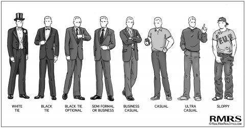
Students must understand that their appearance changes how people view them. They need to know that their attire is a reflection of them and that people judge them based on this. It is understood that when you interview for a position, you should dress one level better than the job you are looking for. For example, if the job you want requires business casual attire, you should be in full business clothes when you show up to the interview. This extends to the realm of presentations. You need to be better dressed than your audience (if possible). If everyone is in suits, you don’t need to show up in a tux or formal dress. However, if everyone is in business casual, you should be in a suit.
This “first impression” also extends to class work. When an instructor picks up your written assignment, they will see how it looks. They will see the font, the margins, the structure, etc. and will begin to judge it, even if it is only subconsciously. In my classes, the students are required to create an outline. I explain that this is a visual representation of what your speech will contain. It is structured in such a way as to make it easy for anyone to identify what supports what.
This outline needs to be cleanly structured. The font should match from beginning to end. Sure, there are bold and italics and varying sizes for different headers, but the actual font should be consistent. The color should also be the same throughout. Mixing fonts, having inconsistent background colors without purpose, random size changes, etc. creates visual clutter that distracts the reader. This impacts how the grader sees what you have done and may affect how they grade.
It is drilled into us that we cannot judge a book by its cover; we shouldn’t prejudge someone based on their appearance. However, we do. No matter how hard we try to not let appearances bias our view, there is still a bit of that predisposition to lean one way or another, based solely on that visual.
This applies to assignments as well. If I get an outline that isn’t “pretty,” I tend to critique them a bit harsher. I have a finite amount of time to deal with any one assignment. If I have to spend too much time on the lack of prettiness of it, I have less time to spend on the content.
I like pretty!
Remember that first impressions are just that, first impressions. There is a saying, “you never get a second chance to make a first impression.” According to one Harvard study, it takes eight positive encounters to overcome a bad first impression. You don’t get that many in academics. You submit your work and go. It is a fire and forget kind of situation. In my class, I review outlines repeatedly and therefore you do get a second (or third, or fourth, or…) chance. Make it pretty and the rest will follow. Take pride in your work for in academia, your papers are your work. Make certain that the audience is not on the defensive before the first word is read. I like pretty things as do most people. Take a few minutes to ensure that what you turn in is as pretty as can be.
Comments
I Like Pretty Things — No Comments
HTML tags allowed in your comment: <a href="" title=""> <abbr title=""> <acronym title=""> <b> <blockquote cite=""> <cite> <code> <del datetime=""> <em> <i> <q cite=""> <s> <strike> <strong>